Audience Interviews
These interviews showed us:
- At the beginning the two being interviewed both gestured to each other with a thumbs up and a nod showing that it was good in some way - We therefore know our opening is good
- That when watching the trailer people don't tend to take their eyes off it and it is therefore very interesting all the way through
- People around the 18 year old age group would rate our trailer 7 or 8 out of 10
- Tom (left) stated that the music complemented the visuals quite well
- There are parts considered very scary which can either be based on our large use of fake blood in our props or even the tense soundtrack
- Both viewers successfully read and understood the titles so we can infer that they were appropriate /eye-catching /clear
- It is clear what the genre of the film as they could clearly tell us when asked without any hesitation , but the sub genre is up to personal interpretation one saying that they thought it was slasher and the other saying it was psychological
Audience Survey
To indicate what we learned from our audience feedback, we read through everything that people had said throughout the development of the project and also used different methods to obtain new opinions on our finished trailer, poster and magazine cover. For this we created a survey! We decided to make this survey to assess how good the target audience found certain elements of the three finished media elements. Below are the questions we asked and the results:
We asked 11 people the following.
| = 1 vote for that answer
How did you find our trailer?
- Interesting ||||
- Exciting |
- Scary |||
- Tense |
- Boring |
- Slow |
Did the trailer make you want to watch the film?
- Yes |||||||
- No ||||
Did the music make the trailer more tense and scary?
- Yes ||||||||||
- No |
Did you notice the non-diegetic sound effects that were added in?
- Yes ||||||||
- No |||
If you noticed, what effect did they have on the trailer?
- Made it scarier ||||
- Made it more tense |||
- Made you focus on it more |
- Made it less effective
What images were most scary and unsettling?
- Outdoor shots of the setting
- Shots of the killer |||||||
- Shots of drawing
- Shots of blood and gore |||
- Action shots (people being put in boot/people being killed)
Did you notice the filters we added to every scene, and did they make any difference to your viewing experience?
- Yes I saw them and yes they made it better |||||
- Yes I saw them but they made no difference |||
- No I didn’t notice |||
Did you feel our trailer got scarier as it developed?
- Yes |||||||||
- No |||
Were the titles easy to follow?
- Yes they could be read easily and I understood them ||||||||||
- Yes I could read them but they didn’t make sense to me |
- They were too quick to read
- They were unclear
Was it clear what our genre was?
- Yes ||||||| (Psychological)
- No ||||
What age range did you feel was our target audience?
- 15-18 ||
- 18-21 ||||
- 21+ ||||||
Did you like the mix of male and female victims?
- Yes it was interesting |||||||||
- No it was not good ||
Do our poster, trailer and magazine tie in together?
- Yes |||||||||
- No ||
What part of our poster stood out the most?
- Colours used |
- Information given
- Images used |||
- Text |||||||
What part of our magazine cover stood out the most?
- Colours used |
- Information given
- Images used ||||||
- Text |||
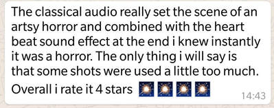
Social Media Reactions - Whatsapp
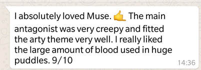
|
|

|
|
Our Reaction:
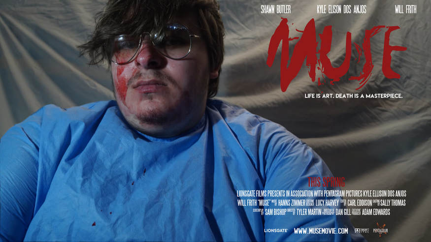
We crafted the appearance of our main character around the artsy theme giving him glasses and a sweater for the look of a more eccentric person. The blood used was poured directly onto our actress from a bucket and then filmed as it pooled out across the plastic covered floor to get the desired effect. |
Our Reaction:
In terms of audio we decided to go with something more classical with piano and a very fast pace. This is usually associated with the traditional arts such as painting. As for the drawing shots used, we do feel they were used a little too much - However these could be seen to emphasise how important the fact he is drawing is and overall enforce the idea of 'Muse'. |
More Reactions to Our Work
'The trailer is interesting because variety of different angles and shots.' - Shawn Butler, with no media experience
We are happy that this is noticeable when watching our trailer because showing variety in the way we filmed was one of our main concerns. There are over a variety of different angles used, including a birdseye view when the blood can be seen pooling from our female protagonist. A type of shot used for example would be the off kilter used when filming from the killer's point of view and him adjusting the camera.
We could improve our trailer by adding a few more locations and perhaps a few more pieces of arty symbolism to reinforce the overall theme. Also the group overall agreed that it would be interesting to see what kind of response we'd receive if our trailer featured a lot more of this arty imagery in the place of other more 'boring shots'. We think this due to how a lot of the horror trailers we studied worked more with symbolism rather than revealing elements of the actual movie.
'The trailer would be better with more dialogue throughout, especially from other characters and not just the voice over.'
-One of our media teachers
This was a piece of feedback we received from our teacher after we had finished our project. From the beginning of the idea to final production, we always intended to have the main antagonist explaining his actions and not really have any input from other characters apart from screaming. Although many trailers feature little dialogue, we were inspired to limit ours to just to one character reading a few words, like the recent 2016 film Hush. We chose this because the film 'holds a 94% approval rating on review aggregator website Rotten Tomatoes based on 16 reviews and has an average rating of 7.8/10'.- Wikipedia. We feel this was effective as a voice over as it did add some tension to just hear one male voice speaking, however we do see how adding more speech would have been effective in adding depth to the trailer.
Overall we feel the trailer has a chilling effect because the audience sees a horrible amount of blood and traumatic wounds caused by the mysterious 'art' killer along with the innocence of the those being captured. This combined with the almost intimate voice over from our antagonist give them a similar feeling to being the victim and are therefore feeling just as scared.
However, if we could have more time on this project we would have liked to make an alternative trailer that does have a lot of dialogue from various other characters to add lot more depth. Other than our teacher's comment, our feedback has been good and others who have watched our trailer right now, media students and non media students, have not commented on the tense silence in our trailer negatively.
'The trailer seems realistic because it matches the poster and magazine cover plus features all the conventional things you would see on a trailer like a distribution company clip and end card' - Dan Jon, a friend and fellow media student
This observation was made because we worked hard to ensure that we made our trailer, magazine and poster realistic. Examples of how we made sure we did this could be the distribution and production company clips in the trailer, tied with the date of release, the hashtag and the social media icons. On our poster, we have shown the hashtag in continuation with our trailer. We have also included the same slogan that we show in our trailer. Our magazine continues the same sort of colour scheme and same theme in terms of the relevant images from our trailer we used (for example the background from the kill room setting in the poster). To continue to be successful with this, if we had more time, we could have planned a bigger advertising campaign which could utilise social media platforms like Twitter, Facebook and Instagram. We could post mini teaser clips, tweet a countdown of days left until the film is in cinemas and circulate information about Muse to gain public attention.
Rate Our Poster and Magazine Cover
|
|
