How effective is the combination of your main Product and Ancillary Text ?
When we was creating our trailer, we made sure that we spoke about the branding and ancillary texts that we needed across all three of our media products. To do this we needed to look at examples from horror genre, for us this helped us straight away with what to do in our trailer, magazine and poster. When it came to doing the branding, we needed to make sure that we used well known brands, this would help our trailer to be more well known to the audience that we are trying to aim our trailer at.
Iconic Images
|
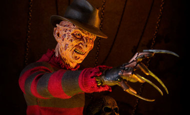
Nightmare on Elm Street:
One of the most iconic images in the horror film industry was the use of the gloves with the knives on, the clothing and the hat from the film 'Nightmare on Elm Street', this was released in 1985. These props were so significant in the film that anyone would recognise that this was the killer within the film. This is the main reason as to why we wanted to have an iconic image within our trailer and other products. |
|
Iconic Texts
|
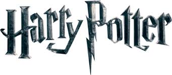
Harry Potter:
The film Harry Potter was an incredibly popular film in 2001, as well as the font, we would be able to recognise it straight away. The font of the film title represents the whole film itself, this is because of the of the style of the letter 'P' in the title. This represents Harry's scar on his forehead. |
|
|
|
Back to The Future:
The film Back to The Future was a very popular film in 1985, as was the film title text. This was an iconic text because if you use this font for something different, we would instantly recognise the font and know that it is from back to the future. |
Iconic Posters
|
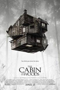
The Cabin In The Woods:
The Cabin In The Woods is very iconic film that was released in 2012. This poster makes the film even more iconic because of how they have positioned the house. The house is dark and twisted which represents what happens in the film. The contrast between the house and the background draws the eye to the centre which is why the house is the most iconic part of the poster. With the main image in the poster and the title of the film being the same, it helps the audience understand the main aim of the film without even watching it. |
|
|
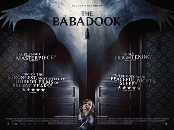
The Babadook:
The Babadook was released in 2014, at the time this was a well known film that attracted a lot of people just by its poster. The poster is very iconic because it is taking the feel of a children's book and making it into a horror which is clever. The way the title is positioned, its making you focus more on the image of the weird looking creature rather than everything else. |
|
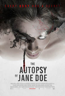
The Autopsy of Jane Doe:
The Autopsy of Jane Doe was released on the 23rd of March in 2017. This film was well put together and as many people say 'amazing'. The poster doesn't express the true meaning of the film which makes it even better, on the poster it is showing the woman's body led down but it looks as if she is floating. This is what is attracting people to the film because it is showing a crime although it is paranormal at the same time because of the floating body and blood on the poster. |
|
Iconic Magazines
|
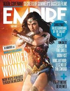
Empire is one of the most iconic magazines of film. This magazine mainly shows the news about recent films, the reviews of films and sneak peek previews of upcoming films. With this magazine they are sticking with one film to focus on which is 'Wonder Woman', this film was released on the 15th of May in 2017. With the main image, they have kept it simple with only showing the main character of the film. This shows that they are going to be talking about the film 'Wonder Woman' throughout the magazine.
|
Our Final Poster
Original Image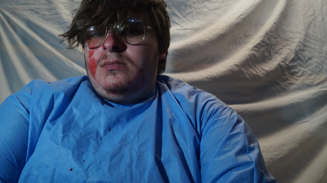
For this image we tried to re-create a clip from our trailer. To do this we just got a plain white sheet for our background and made it look creased so that it looks similar to our trailer, this helps people to know the connection that we are trying to show between our trailer magazine and poster. When we took a picture of the image we wanted to make sure that the background related to our trailer.
|
Throughout Editing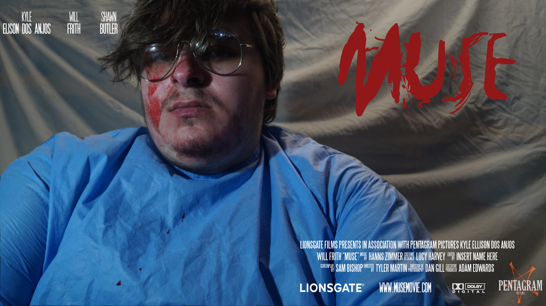
When it came to editing our poster, we made a lot of changes to the background of the picture. As you can see from this image, the white sheet in the background has a lot more shadows in the creases, in the original picture you can clearly see that there was highlights all over. Throughout editing, we looked at different fonts that we could use. We finally decided to use the font called 'Horros'. To see this font go to the page called 'Fonts and Justifications'.
|
Finished Poster
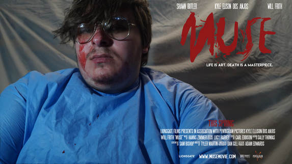
At the end of our editing, we made a few changes to the names. We moved them from the top left corner into the right hand corner, we made this decision because we thought that the names looked out of place in the left. At the end of it we decided that this would make the poster look much more appealing. We made this change to our poster because we asked our target audience what they thought could make this poster better, majority of our target audience said that they thought the writing would looked more aligned if we had it above the trailer title 'Muse'. To achieve this final poster, we had to make brightness and contrast changes to our poster. By doing this we had to lower the brightness on our poster, we masked Kyle out of the original image and took the brightness down from the original image, then placed Kyle back on top of the edited background. We did this so that our main character is standing out to us and our audience. Another change we made to get our final poster is that we edited the size of our production company logo, as you can now see, it fits perfectly with the size of everything else and doesn't look out of place.
We decided to make this jigsaw for our poster as well as our magazine, this is so that its gives our audience some sort of interactive activity do to and to try and see if they know what our poster and magazine look like.
Our Final Magazine
Original Image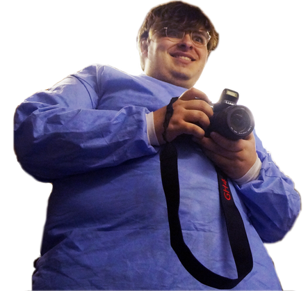
Before we made the magazine, we decided to recreate this image from our trailer. We picked this image because we thought that this would appeal to our audience so they can see that our main character is very psychotic and strange. When editing our image, we decided to take away the background as it was originally white and we didn't feel like it was fitting in with the magazine cover. In the end we decided to put it on a darker background as shown on the finished magazine, we also decided to edit a camera flash onto the top of the camera to make it more realistic. We also decided to dull down the colour of Kyles skin as it looked to fake and photoshopped.
|
Finished Magazine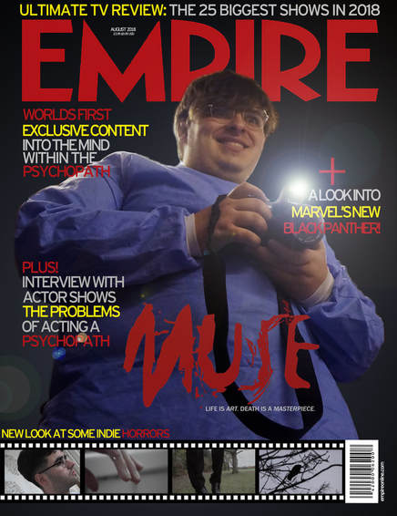
At the end of our editing on our magazine we decided that we wanted this to be the finished magazine. As you can see it has changed a lot from the original image. We me sure that the colours in our magazines all matched, as you can see our trailer title 'Muse' and the title of the magazine 'Empire' are the same colour. This helps our main texts stand out to our audience. Along the bottom of the magazine, we have took clips from different trailers. At the front, we have said "A new look into Marvels new Black panther", this is showing to our audience that our magazine isn't just horror it is also Sci-Fi as well. This helps our magazine appeal to different audiences. When we was editing we also decided to make the background look blurred and dark compared to the rest of the photo, this is so that it would make the focus of the audience more the main characters face than the background.
|
