In what way does your media product use, develop or challenge norms and conventions of real media products?
Trailer
Use of Conventions:
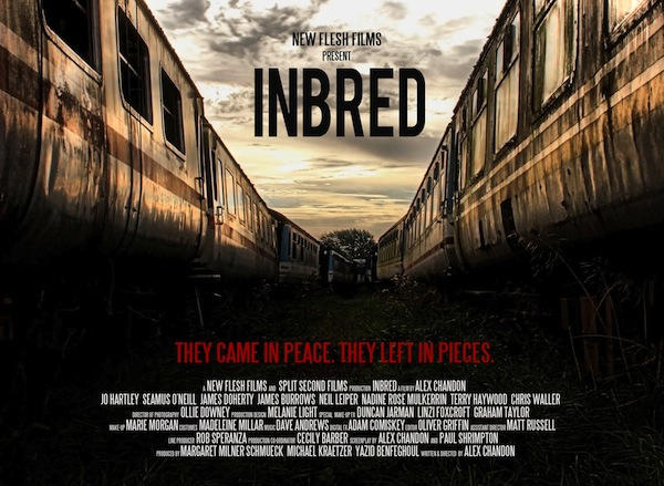
One of the first conventions seen in this trailer is the use of creepy drones in the background. We decided to use these as they are definitely one of the easiest and effective ways to cause tension in trailers, this would make it more likely to make people watch it because if they felt like they were getting scared and getting into the trailer then they would want to watch the movie. This can be seen in Hannibal and The Shining.
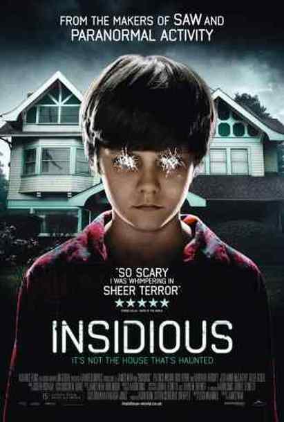
Another convention shown in our trailer is how we started with a slow pace and gradually build up the pace causing the tension to be a lot more effective than it would be going from fast right at the beginning than at the end, this would make the trailer boring if there wasn't any content to keep up with the fast pace nature. Examples of this can be seen in Sinister 2 and Paranormal Activity.
Another convention used within our trailer is the use of classical music this can be seen in a lot of psychological horrors where it makes out the killer has such a artistic sense of music that it makes the audience feel scared by the fact these killers can be like us with hobbies like this but still have this urgency to kill people. This can be seen in movies like Black Swan.
Another convection we used was having a man as the killer. We chose to do this because we felt like if we didn't the trailer would end up being completely different from a horror movie and more like an art piece, so we felt that for it to stay true to what it is and allow some conventions to stay the same. movies which use this convention include Nightmare on Elm Street and Friday the 13th.
Developing Conventions:
We eventually decided that the killer should be more artistic rather than being more of a doctor, this let us play on the convention that there are these psychopathic killers who only want to kill to make their art. We had to develop this since a doctor saves lives and in our minds that didn't make sense. We took inspiration from the psychopaths from the tv show of Hannibal where there are these killers who create art pieces from these dead bodies.
Challenging Conventions:
We challenged the convention of horror multiple times throughout this trailer one example of this would be the fact we didn't show any kills despite there being corpses, this was because we much rather wanted to focus on the mind of the main killer. This works well because western horrors tend to always follow conventions and because those conventions are used over and over it doesn't actually become that scary unless your easily scared. However by focusing on the psychological aspect of a killer it can be used to be a lot scarier since it shows reasons as to why they may be like that, this causes people to feel pity for the character even though they kill. This can be seen through many psychological horrors such as Se7en and Saw.
Another way we challenged conventions was through appearance of the actual killer, in a lot of horror films the killer tends to wear a mask, this can be seen through movies such as Saw, Scream and The Purge. However our killer has nothing hiding his face, this was used to make the killer seem more psychopathic almost like the killing the art everything evil he does is just who he is, as in the other films the masks almost make them seem like they are running away from their identity, but with our killer he seems almost proud of who he is. This can be seen in movies like Hannibal and The Shining
One of the first conventions seen in this trailer is the use of creepy drones in the background. We decided to use these as they are definitely one of the easiest and effective ways to cause tension in trailers, this would make it more likely to make people watch it because if they felt like they were getting scared and getting into the trailer then they would want to watch the movie. This can be seen in Hannibal and The Shining.
Another convention shown in our trailer is how we started with a slow pace and gradually build up the pace causing the tension to be a lot more effective than it would be going from fast right at the beginning than at the end, this would make the trailer boring if there wasn't any content to keep up with the fast pace nature. Examples of this can be seen in Sinister 2 and Paranormal Activity.
Another convention used within our trailer is the use of classical music this can be seen in a lot of psychological horrors where it makes out the killer has such a artistic sense of music that it makes the audience feel scared by the fact these killers can be like us with hobbies like this but still have this urgency to kill people. This can be seen in movies like Black Swan.
Another convection we used was having a man as the killer. We chose to do this because we felt like if we didn't the trailer would end up being completely different from a horror movie and more like an art piece, so we felt that for it to stay true to what it is and allow some conventions to stay the same. movies which use this convention include Nightmare on Elm Street and Friday the 13th.
Developing Conventions:
We eventually decided that the killer should be more artistic rather than being more of a doctor, this let us play on the convention that there are these psychopathic killers who only want to kill to make their art. We had to develop this since a doctor saves lives and in our minds that didn't make sense. We took inspiration from the psychopaths from the tv show of Hannibal where there are these killers who create art pieces from these dead bodies.
Challenging Conventions:
We challenged the convention of horror multiple times throughout this trailer one example of this would be the fact we didn't show any kills despite there being corpses, this was because we much rather wanted to focus on the mind of the main killer. This works well because western horrors tend to always follow conventions and because those conventions are used over and over it doesn't actually become that scary unless your easily scared. However by focusing on the psychological aspect of a killer it can be used to be a lot scarier since it shows reasons as to why they may be like that, this causes people to feel pity for the character even though they kill. This can be seen through many psychological horrors such as Se7en and Saw.
Another way we challenged conventions was through appearance of the actual killer, in a lot of horror films the killer tends to wear a mask, this can be seen through movies such as Saw, Scream and The Purge. However our killer has nothing hiding his face, this was used to make the killer seem more psychopathic almost like the killing the art everything evil he does is just who he is, as in the other films the masks almost make them seem like they are running away from their identity, but with our killer he seems almost proud of who he is. This can be seen in movies like Hannibal and The Shining
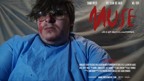
In our poster we decided to have a picture of the killer as the trailer and the movie revolves around the mental state of this character and why he does what he does. we chose to have a lot of lighting in the photo as it would make the shadows on the face contrast more leaving more of a scary feel to it. However because we used a light when taking a photo this caused the background to be very bright so we clipped around the character and made the rest of the scene darker with a gray overlay on the top of it.
We chose to go with a red and white colour schemes because these are two of the most used colours in horror not including black, this is because the red on the muse and this spring will heavily represent the bloodiness of the film and how gruesome the art will be. We did consider using the final piece of what the killer creates as the main focus of the poster but many people would be confused and not know what it is about, we feel it will also give too much about the movie as this scene should only exist on the film.
We decided to go with SF Movie Poster because it can be used to create the little titles within the mentioned names area, it also worked well because it is quite a modern san serif font which allows the font to be easily read and because it fits in with the convention of movie posters.
We decided to have the poster going landscape because you don't really see it that much and we thought it would frame our photo better. This worked with our poster because it allowed the poster to look aesthetically pleasing whilst also being used as a marketing device.
With our tagline we decided that we wouldn't originally use the three word tagline trope as our ideas were not fitting it however we eventually came to the conclusion to use two sets one with the three word tagline and one with having more. Having it like this allows the two statements to contrast each other and this makes the viewer unintentionally recognise the similarities in the statements, therefore they will see that life is art, but death , which in normal circumstance would be worse than life, is a masterpiece, this shows that death is becoming the ultimate form of life as a masterpiece is the ultimate form of art.
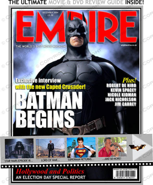
Magazine Cover:
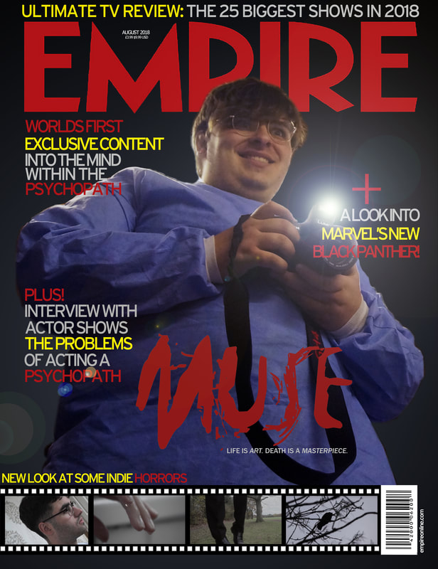
In this poster we took inspiration from the Empire magazine company and made in their style a poster for our movie.
The first thing we did was putting a background on, we did this being having a spot gradient from a blue the same colour as part of the operating gown to black, by having it the same colour as the gown it allows the whole image to work well with each other since it is using similar colours, this makes the background and the character almost blend in, however the characters head is protruding above the Empire logo (a classical trope used in Empire magazines) which makes the photo stand out, so the fact the photo is blending in with the background whilst popping out of the foreground allows the whole piece to work as one without the feeling of loss of space.
The title of the film was the same one as the poster, we did this to keep a consistent market identity so despite the different pose the character is still part of muse. the font we used around the magazine was interstate, this allowed the font to look exactly like the font used in Empire magazines therefore making the whole image look a lot more professional, within the font we went with the colour scheme of red, cool grey and yellow these colours worked well because red and yellow are both part of the primary colours and since blue made up the character and the background it wasn't needed but the combination of the three primary colours makes the piece to both contrast as much as they can whilst still working well with each other. The cool grey was used since it isn't as dark as black and black wouldn't of worked well as it wouldn't contrast the background, but I also didn't go with white since that would contrast too much and stand out more than the other text. This allowed us to choose a cool grey as it is in between black and white keeping both of their characteristics to which we desire. It is also made to look professional by having a barcode with a URL underneath it and by having the date and price on it really makes it look like an actual Empire magazine. Another way it makes it look real or professional is through the way we copied Empire classic tropes of having 'plus!' and a literal '+' with extra content within the magazine. We tried to use similar text content that Empire would use on their magazines so that it can appeal to a wide audience all at the same time.
At the bottom of the page we put a film reel looking image with images from another trailer in our year, labelled 'new look at some indie horrors' this was used to make the magazine to work better since there was a large area at the bottom of the magazine without that, which wouldn't happen on a magazine unless they're promoting one of the biggest films of the year, since they need to put the contents of the magazine all over the front cover so that as many people will want to buy it as possible.
Finally we finished off the magazine poster by rendering in a cameras flash which produces a bright light with a light flare working accordingly to the light source, rendering in the light allowed the magazine to pop out more than it already does since this bright white area really draws in the audiences eye sight so this will allow more people to buy the magazine.