Initial Font Choices
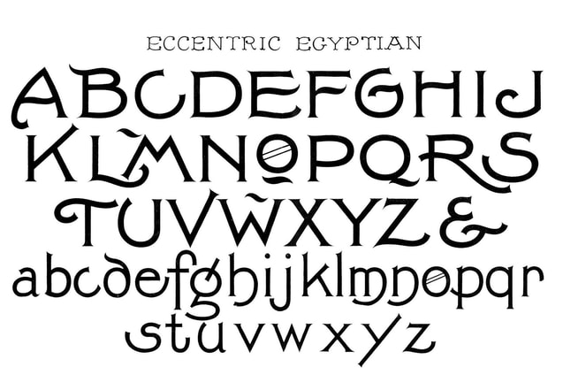
The first font we used in our trailer was called 'eccentric Egyptian'. This was due to how old fashioned it looked which we thought would be a good fit for the vibe of the trailer due to the main feature dressing like an older man from the 1970s. We decided against this font however because it did not give off enough of an arty effect that we wanted and instead looked for more 'brush stroke effects'.
Final Font Choice
After testing several different fonts to see what we be appropriate for our trailer, we ended up searching the internet for a font which would resemble something artistic and therefore suit our theme of art a lot more. As seen in the picture below this font appears to be corrupt as certain parts of the letters
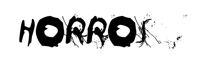
|
|
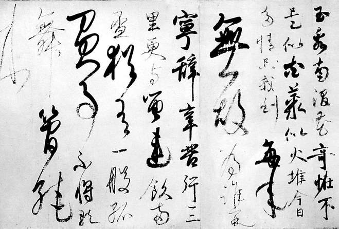
This font was inspired by the fact the main antagonist in our trailer focuses around painting and art, meaning that he would need an equally messy font to go with the film and all associated branding. We also draw some inspiration from Japanese calligraphy and how smudgy it appears when a brush is running dry - Giving a great affect for a poster.
Overall we decided on this more intricate title with paint / ink specs around the lettering due to how closely we can link it with the film's subject matter. This imagery can also be associated with blood and (as seen in our poster) coloured red to give this more sinister effect.
